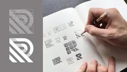
Logo Design with Grids: Timeless Style from Simple Shapes 
This course teaches students how to create a timeless, minimalistic logo design from simple shapes. Students will learn how to use grids to refine their design and add the perfect finishing touches to make it stand out. With this course, students will be able to create a modern logo that will be sure to make an impact. ▼
ADVERTISEMENT
Course Feature
![]() Cost:
Cost:
Free Trial
![]() Provider:
Provider:
Skillshare
![]() Certificate:
Certificate:
Paid Certification
![]() Language:
Language:
English
![]() Start Date:
Start Date:
On-Demand
Course Overview
❗The content presented here is sourced directly from Skillshare platform. For comprehensive course details, including enrollment information, simply click on the 'Go to class' link on our website.
Updated in [February 21st, 2023]
What makes a logo design feel [perfect]? How do you fine-tune simple shapes to achieve visual stopping power? Learn how to design a modern minimalistic logo from start to finish and then add that extra punch of perfection to make it stand the test of time
In this 30-minute class graphic designer George Bokhua walks us through his process of incorporating grids and geometric shapes into logos so that you can unlock that feeling of timelessness in your own marks
Key lessons include:
Why gridding is important + examples for inspiration
How to sketch your logo on grid paper
Executing your mark in Adobe Illustrator
Adjusting your grids to complete the mark
This class is perfect for graphic designers and illustrators looking to explore a methodical approach to logo design as well as entrepreneurs and brands who need a starting point for making their own logos stand out
If you're totally new to Adobe Illustrator have no fear; this exercise lives 80% on paper and that extra 20% of polish takes place on the computer
So grab a pencil and let's make beautiful marks together!
______________
What Youll Learn
Introduction
Shapes and symmetry are innate to our understanding of the world around us Perhaps this is why so many designers use deceptively simple shapes to design logos that appeal to our most basic instincts and create images with lasting appeal In this course on how to design logos George Bokhua offers his 10+ years of experience to show you how to use grids to achieve that look of geometric perfection
Why Gridding?
Grids allow you to arrange information in a more structured manner In today's world the ability to convey a great deal in the shortest time possible can make the difference between success and failure A viewer must instantly understand what they are seeing In his series of design tutorials George shows that using grids to design is not constructive but rather a versatile way to create a unified form that communicates its message quickly and clearly He'll give you examples from past Olympics as well as the art world to demonstrate that gridding can help you create logo designs with universal appeal
Gridded examples from George's own work
George will then open up his sketchbook and show you not only examples of his previous works but also the different types of grids you might use to create your own From 30-degree grids to dot grids and more there is an option that suits your style He shows you how to simplify any complex form In one example he uses the golden ratio in art to create an incredible swan logo out of simple shapes You will learn how to use grids to identify inconsistencies in your design as well as tips for keeping your design balanced
Sketching Logo Ideas
From there you will start to sketch out your own concepts under George's expert guidance He'll give you hints on how to approach your project and build on existing shapes to quickly construct the basic elements as well as identify good positive and negative space to explore when you design a logo Starting with the letter R' he will talk you through his approach and help you arrive at a concept that you are comfortable taking to the next stage
Gridding your logo on paper
As George says sketching your ideas on paper familiarizes you with your subject's shape and in this phase he will help you develop your idea further while avoiding common pitfalls He'll help you save time later by giving you tips on using a compass and ruler to maximize your sketch so there's less work to do later on
Executing your logo in Illustrator
Once you're ready you will bring your ideas into Adobe Illustrator and take them to the final level He'll show you how to quickly and accurately recreate your sketch grid in the computer and then use it to ensure that your design is perfectly aligned with the specific reference points Using wireframe mode he'll show you how to identify and fix any problems before moving on
Finishing Touches
Now that you have a sleek stylish logo you might want to change a few colors or invert black and white to make sure it will work in any situation George gives you a few ways you can easily do this in Illustrator as well as a few tips to subtly enhance your design At the end you should have a clean professional-looking logo that will look great anywhere
For an overview on logo design theory with George Bokhua join 20000 fellow students in his previous class Design a Logo in Modern Style
___________________
Looking for more inspiration? Head here to discover more classes on logo design
Pros & Cons

Great introduction.

Opened up a new avenue for logo creation.

Inspiring idea with grids and paper.

Needs more practice.

Not for everyone.

No thanks.
Course Provider

Provider Skillshare's Stats at AZClass
Discussion and Reviews
0.0 (Based on 0 reviews)
Explore Similar Online Courses

DIY Cinematography: Make Your Video Look Like a Movie

Pen and Ink Illustration: The Basics for Creating Magical Drawings

Python for Informatics: Exploring Information

Social Network Analysis

Introduction to Systematic Review and Meta-Analysis
The Analytics Edge

DCO042 - Python For Informatics

Causal Diagrams: Draw Your Assumptions Before Your Conclusions
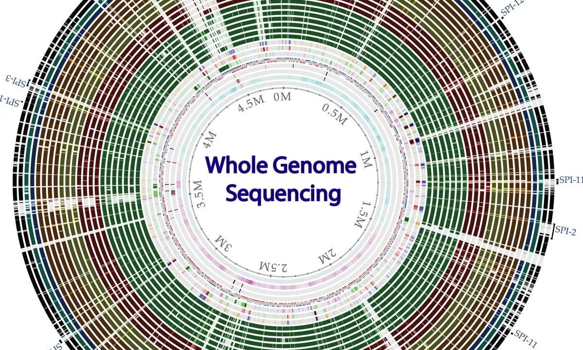
Whole genome sequencing of bacterial genomes - tools and applications

Complete Graphic Design Course Explaining Psychology (MUST KNOW)
Graphic Design Tutorial For Beginners Graphic Design (Full Course)

Start your review of Logo Design with Grids: Timeless Style from Simple Shapes