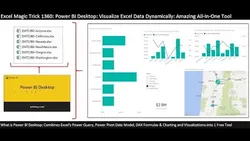
Comprehensive Power BI Desktop Example: Visualize Excel Data & Build Dynamic Dashboard (EMT 1360) 
This course provides an in-depth look at the entire process of using Power BI Desktop to visualize Excel data and build dynamic dashboards. It covers topics such as importing multiple Excel files from a folder, naming queries, transforming extension columns to lowercase, and filtering files to only include specific extensions. By the end of the course, participants will have a comprehensive understanding of how to use Power BI Desktop to create powerful and interactive dashboards. ▼
ADVERTISEMENT
Course Feature
![]() Cost:
Cost:
Free
![]() Provider:
Provider:
Youtube
![]() Certificate:
Certificate:
Paid Certification
![]() Language:
Language:
English
![]() Start Date:
Start Date:
On-Demand
Course Overview
❗The content presented here is sourced directly from Youtube platform. For comprehensive course details, including enrollment information, simply click on the 'Go to class' link on our website.
Updated in [February 21st, 2023]
) Introduction to entire process for Power BI Desktop, including looking at the finished Dashboard.
) Import Multiple Excel Files From Folder.
) Name Query.
) Transform extension column to lowercase.
) Filter Files to only include ".xlsx" file extensions.
) Remove Columns.
) November 2016 Power Query Update Problem.
) Add Custom Column with Excel.Workbook Function to extract the Excel Objects from each File..
) Delete Content Column.
) Filter to only include Excel Sheet Objects.
) Filter to exclude sheets that contain the word "Sheet".
) Remove Columns.
) Expand Data and Sheet Name Columns.
) Change Field Names.
) Change Data Types.
) Add Custom Column to calculate Net Revenue Column then round Number.Round function. Then Add Fixed Decimal Data Type..
) Remove columns for Amount and Revenue Discount.
) Close and Apply to add to Data Model.
) Import Excel Manager Table. Change Data Types to Text. Close and Apply.
) Create Relationship between Zip Code Columns.
) Create DAX Calculated Column with the IF Function to Categorize Retail Data. Change Data Type..
) Create DAX Measures for: Total Revenue, Total COGS and Gross Profit. Add Currency Number Formatting with No Decimals Showing..
) Create DAX Measures for: Gross Profit Percentage. Add Percentage Number Formatting with Two Decimals Showing..
) Create Map Visualization for Zip Code & Gross Profit Data (Zip Code with relationship to Managers).
) Create Clustered Bar for Manager Names & Gross Profit Data (Zip Code with relationship to Managers).
) Create Clustered Column for Product & Gross Profit Data, with a Line Chart for Gross Profit Percentage.
) Create Clustered Column for Payment Method & Gross Profit Data, with a Line Chart for Gross Profit Percentage.
) Create Slicer for States..
) Create Card Visualization for Total Revenue, Total COGS, Gross Profit and Gross Profit Percentage..
) Summary.
(Please note that we obtained the following content based on information that users may want to know, such as skills, applicable scenarios, future development, etc., combined with AI tools, and have been manually reviewed)
[Course Overview]: This course provides a comprehensive overview of Power BI Desktop, a powerful data visualization and analysis tool. It covers the entire process of creating a dynamic dashboard from Excel data, including importing multiple Excel files from a folder, transforming columns, filtering files, adding custom columns, creating relationships, and creating visualizations. It also covers the November 2016 Power Query update problem and how to work around it. By the end of the course, learners will have a complete understanding of Power BI Desktop and be able to create their own dynamic dashboards.
[Why to Learn]: Power BI Desktop is a powerful tool for data visualization and analysis. It allows users to quickly and easily create dynamic dashboards from Excel data, and provides a wide range of features for customizing visualizations. Learning Power BI Desktop can help learners gain valuable skills in data analysis and visualization, which can be applied to a variety of fields.
[Development Paths]: After completing this course, learners can continue to develop their Power BI Desktop skills by exploring more advanced features, such as creating custom visuals, using the R language, and creating custom measures. They can also explore other data visualization and analysis tools, such as Tableau and QlikView.
[Related Learning Suggestions]: Learners interested in further developing their data analysis and visualization skills can explore courses on Excel, Tableau, and QlikView. They can also explore courses on data science, machine learning, and artificial intelligence.
Course Provider

Provider Youtube's Stats at AZClass
Discussion and Reviews
0.0 (Based on 0 reviews)
Explore Similar Online Courses

The Best & Most Complete Dart Course - Visualize Learn and Practice all Dart Language Concepts!

Anyone Can Draw This ISOMETRIC MINI WORLD in PROCREATE

Python for Informatics: Exploring Information

Social Network Analysis

Introduction to Systematic Review and Meta-Analysis

The Analytics Edge

DCO042 - Python For Informatics

Causal Diagrams: Draw Your Assumptions Before Your Conclusions

Whole genome sequencing of bacterial genomes - tools and applications

Microsoft Power Platform
![Microsoft Power BI : A-Z of Power BI in 90 Minutes : 2023 [Updated]](/ccsimg/td_book/check/c3335b84f65d0fc9166ae7cb130df533.webp)
Microsoft Power BI : A-Z of Power BI in 90 Minutes : 2023 [Updated]

Reporting on maps in Excel & Power BI course
 Related Categories
Quiz
 Submitted Sucessfully
1. What is the November 2016 Power Query Update Problem?
2. What is the purpose of the Excel.Workbook function?
3. What type of visualization is used to show Zip Code & Gross Profit Data?
4. What type of number formatting is used for Gross Profit Percentage?


Start your review of Comprehensive Power BI Desktop Example: Visualize Excel Data & Build Dynamic Dashboard (EMT 1360)