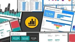
Learn Power Bi - Analyze & Visualize Data with Power Bi - P2 
Power Bi is a powerful tool for data analysis and visualization. This course will teach users how to build data models, create interactive dashboards, and use DAX formulas, charts, and Power Query in Power Bi. ▼
ADVERTISEMENT
Course Feature
![]() Cost:
Cost:
Free
![]() Provider:
Provider:
Udemy
![]() Certificate:
Certificate:
Paid Certification
![]() Language:
Language:
English
![]() Start Date:
Start Date:
On-Demand
Course Overview
❗The content presented here is sourced directly from Udemy platform. For comprehensive course details, including enrollment information, simply click on the 'Go to class' link on our website.
Updated in [February 21st, 2023]
Power Bi Dashboards - Build data models & interactive dashboards using DAX formulas charts & power query in Power Bi
What youll learn:
How to work with Power BI DAX Functions (DAX Measures)
How to work with Power BI Power Query Editor (M Language or M Query Language)
How to work with Power BI Visuals like Charts Tables and Graphs
How to combine DAX Functions Power Query and Visuals to create an impressive multipage dashboard
How to get meaningful insights from any raw data using Power BI
How to analyze Trends and Patterns from any raw data using Power BI
How to create Interactive Dashboards in Power BI
Microsoft Power Bi Data Analysis & Data Visualization - Learn Business Intelligence
This course will provide you the skillset you need to create Dynamic Reports and Interactive Dashboards to analyze and interpret meaningful insights from your any data using a Business Intelligence tool like Microsoft Power BI
We have created content with relevance to real world scenarios
From this course you will learn how to analyze data based on relevance using Power BI
Power BI is a
business analytics
and
business intelligence service
by Microsoft It aims to provide interactive visualizations and business intelligence capabilities with an interface simple enough for end users to create their own reports and dashboards Power BI is part of the
Microsoft Power Platform
Power BI is a
collection of software services apps and connectors
that work together to turn your data from different sources into visually immersive and insightful reports
Using Power BI Desktop you can
create rich interactive reports
with
visual analytics
at your fingertips for free It can connect to more than
65 on-premises and cloud data sources
to turn information into interactive visuals Data scientists and developers work with Power BI Desktop to produce reports and make them available to the Power BI service
In Power BI Desktop users can:
Connect to raw data from different sources
Extract Profile Clean Transform and model the data Build a Relational Data Model using Power Query and DAX
Build and optimize data models and DAX measures
Create charts and graphs using different visualization techniques
Design and create reports and interactive dashboards to get meaningful insights
Analyze hidden trends and patterns
Create and manage datasets
Share reports with others using the Power BI service within or outside the organization
In this course
You will learn data analysis and
data visualization
using
Power Query
M Language
Dax
and
Visualizations
in
Power BI
You will learn about
Power BI Desktop
and its components Learn how to use the
Power Query Editor
to connect Power BI to various data sources
learn how to work on the
Data Models
to get meaningful insights
Topics you will Learn
Power Bi DAX
Power Query
Power Bi Charts and Graphs
Build a multi page Sales Opportunity Analysis Dashboard in Power Bi
You will learn Power BI in a Step by Step Process
Learn how to use
Power BI Desktop
and
Power BI Query Editor
Learn how to
create relationships between related data sources in Power BI
Learn to create Power BIData
Models
using the
Power Query
M Language
and
DAX Formula language
to create powerful calculations
Learn
Power BIDAX
and how to use it to
build custom Measures
Learn to
create Power BI reports
with various types of aggregations and filters
Learn to
create Powerful Interactive reports
and
dashboards
with drill throughs and relative date filters in Microsoft Power BI
Create a wide range of
Power BI
Charts
Graphs
and
Visualizations
using drag and drop methods from
Data Visualization Tools
Learn how to use themes and
custom visualizations
in enhance your reports
By the time you complete this course youll be a highly proficient Power BI user
So what are you waiting for?
Lets get started
Pros & Cons

Perfect match

Excelente curso

Good course

Very interesting and useful tips

Explanation is clear

Great

Poor explanation

Needs more explanation

No explanation of business logic
Course Provider

Provider Udemy's Stats at AZClass
Discussion and Reviews
0.0 (Based on 0 reviews)
Explore Similar Online Courses

Building a Large Format 3D Printer : Part 5: Upgrades!

Kubernetes Security Best Practices you need to know THE Guide for securing your K8s cluster!

Python for Informatics: Exploring Information

Social Network Analysis

Introduction to Systematic Review and Meta-Analysis
The Analytics Edge

DCO042 - Python For Informatics

Causal Diagrams: Draw Your Assumptions Before Your Conclusions
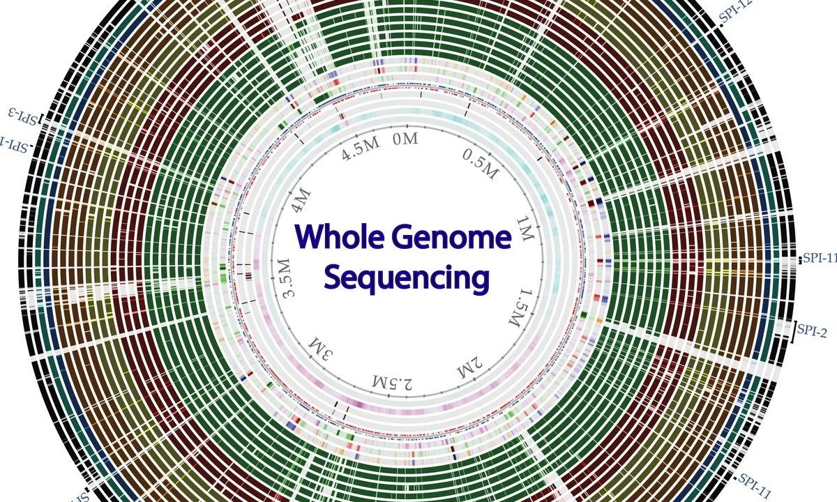
Whole genome sequencing of bacterial genomes - tools and applications

Microsoft Power Platform
![Microsoft Power BI : A-Z of Power BI in 90 Minutes : 2023 [Updated]](/ccsimg/td_book/check/c3335b84f65d0fc9166ae7cb130df533.webp)
Microsoft Power BI : A-Z of Power BI in 90 Minutes : 2023 [Updated]


Start your review of Learn Power Bi - Analyze & Visualize Data with Power Bi - P2